


Visual identity design
Color system, typography, monogram direction, positioning and complete visual language.
A fictional minimalist fashion label developed to demonstrate how Aohana creates a refined identity, editorial art direction and a complete social collection campaign.
← Back to Aohana work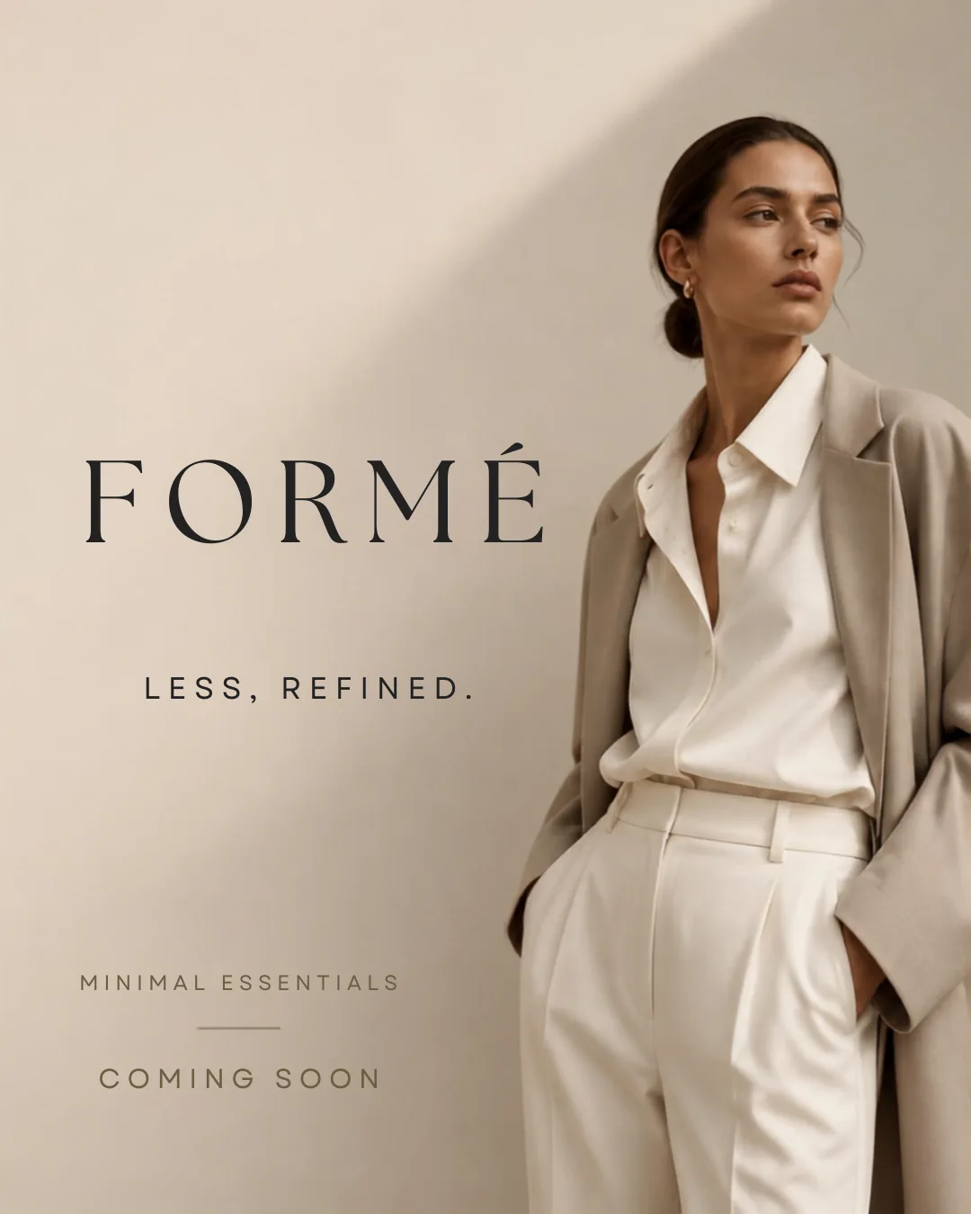
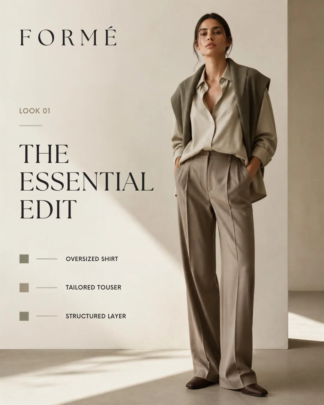
Create a premium fashion identity that feels calm, modern and timeless without becoming empty, generic or indistinguishable from other minimalist labels. Every post needed to feel connected while serving a different stage of the collection launch.
Aohana developed a restrained color system, editorial typography, campaign messaging, material-focused art direction and a nine-post sequence covering launch, teaser, look reveal, philosophy, fabric, lifestyle, countdown and release.
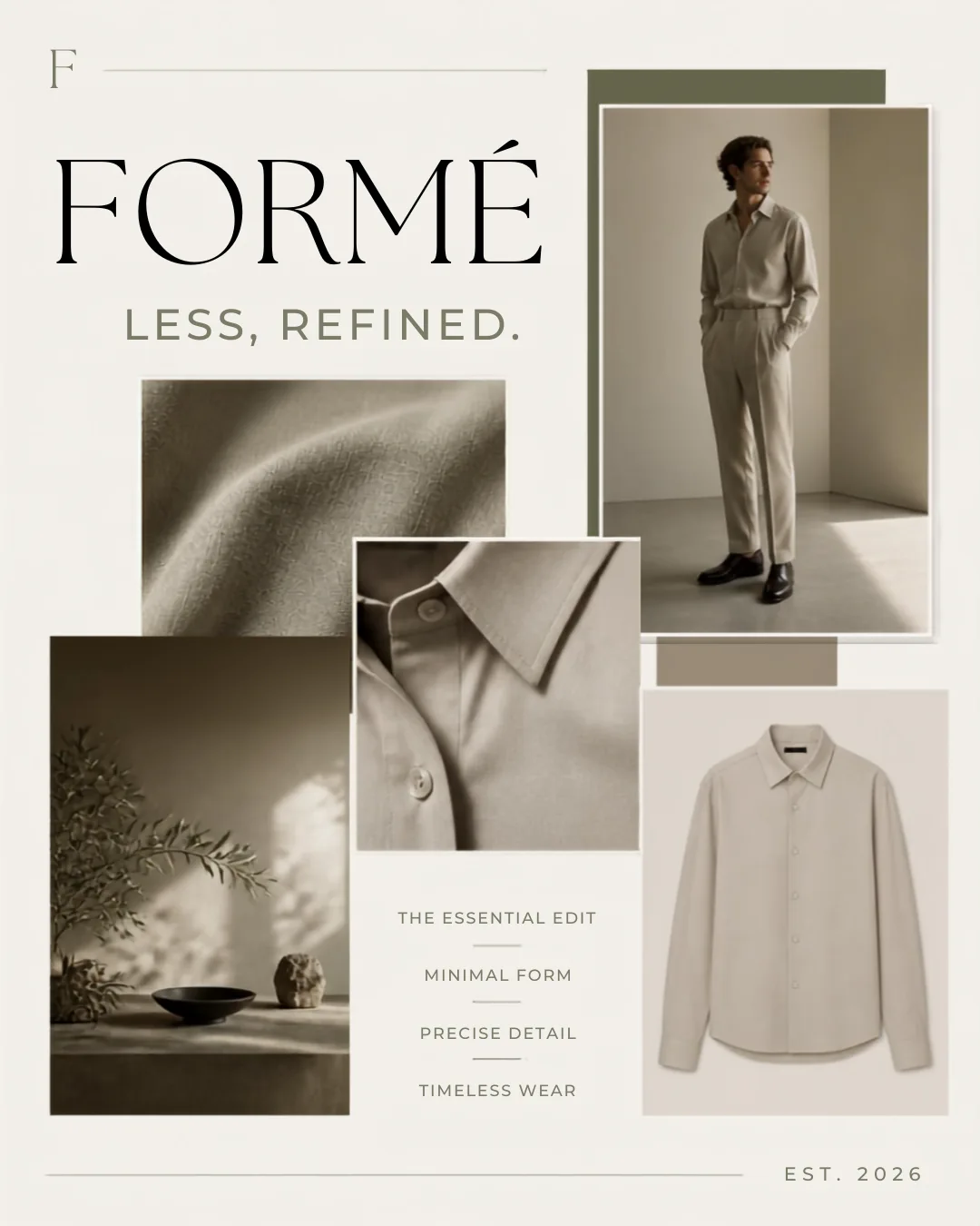
Warm neutrals, refined serif typography, subtle technical labels and generous negative space create a flexible identity that works across product imagery, brand statements and editorial fashion storytelling.
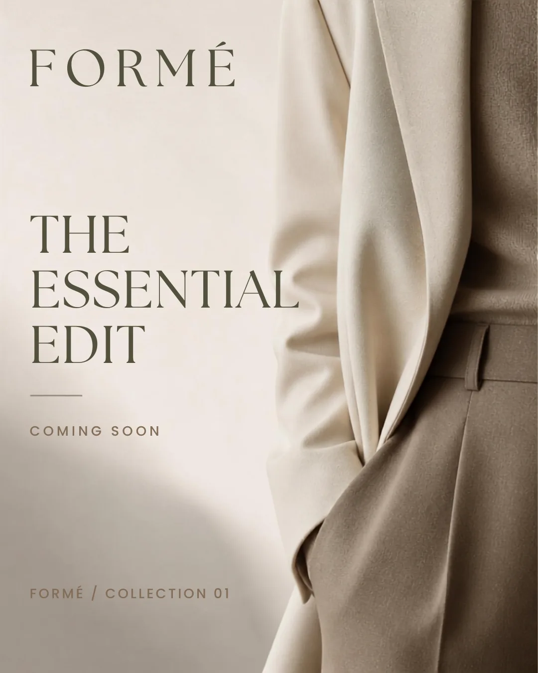
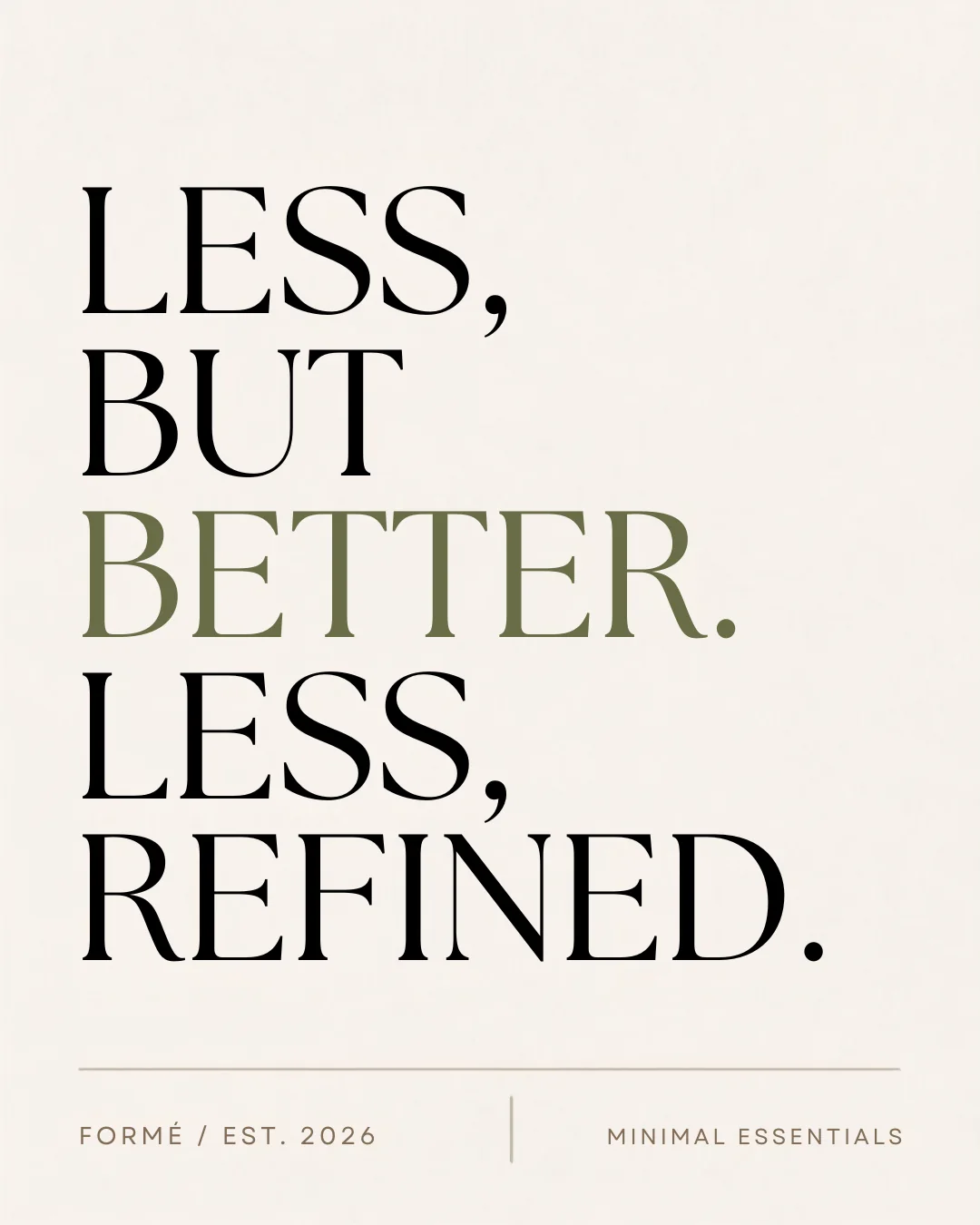
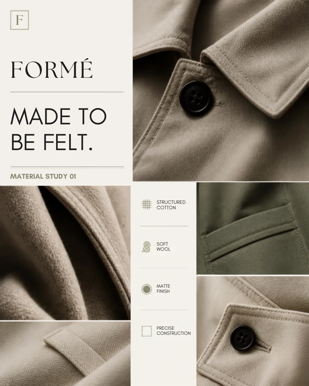
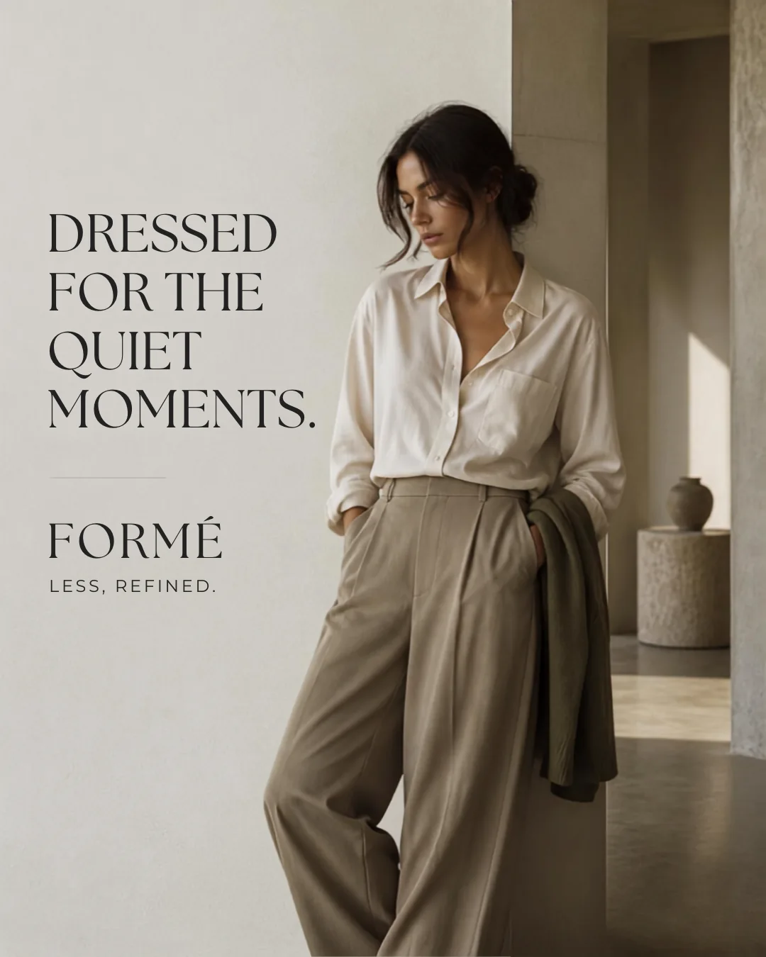
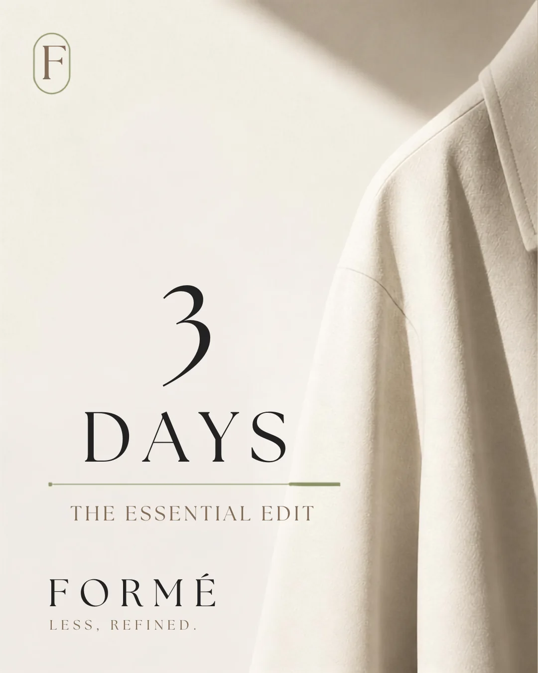
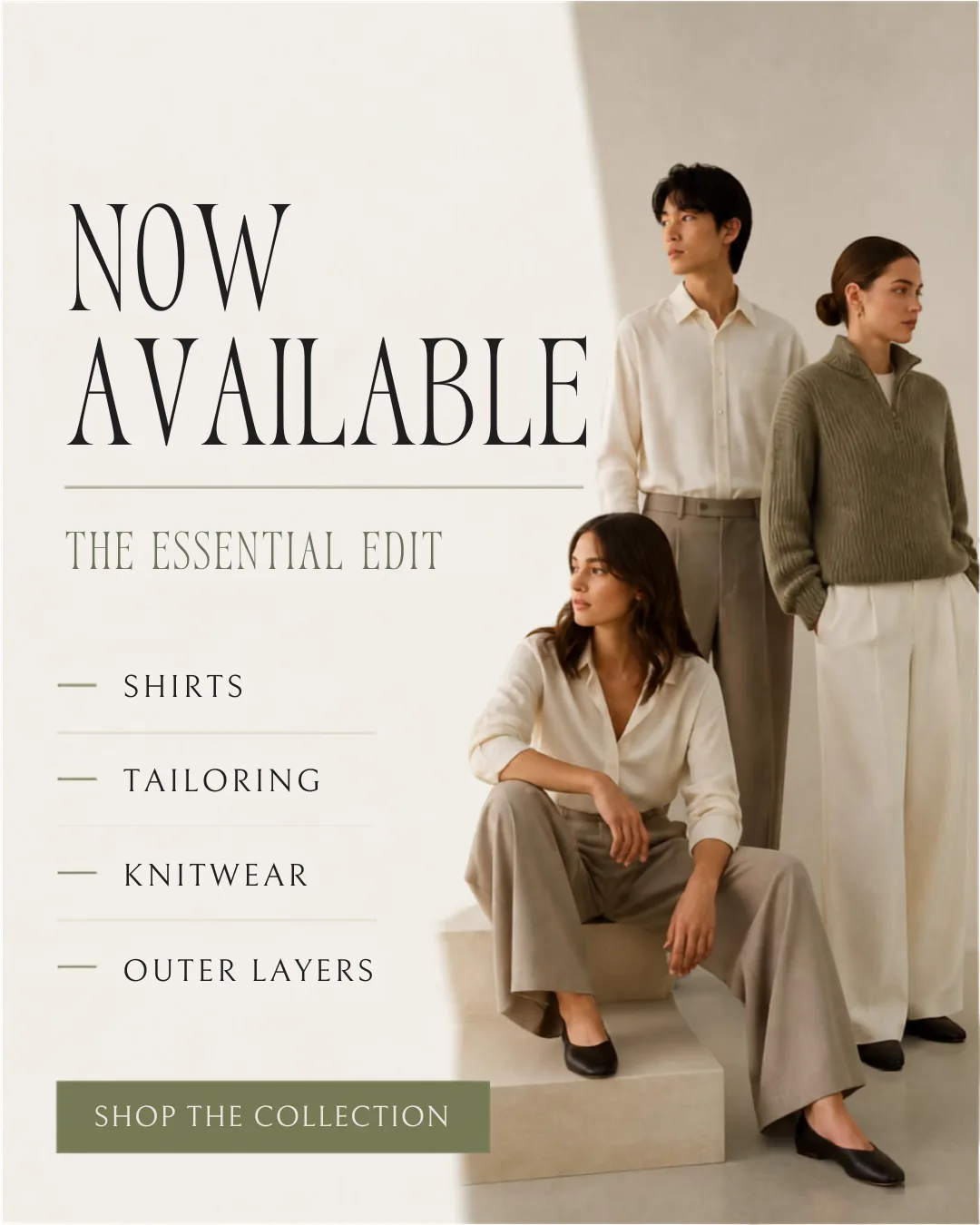
The campaign balances brand-building and product communication: it introduces the world, reveals the collection, highlights material quality, shows the clothing in context and closes with a complete editorial summary.
Color system, typography, monogram direction, positioning and complete visual language.
Campaign layouts, collection reveals, material studies and typography-led content.
Launch sequencing, product storytelling, campaign messaging and grid consistency.
Styling, photography mood, composition, lighting and fashion presentation.
The final project presents FORMÉ as a cohesive premium fashion label with a recognizable identity and complete editorial campaign. It demonstrates Aohana’s ability to build a refined visual world without relying on loud design.
Concept-project notice: FORMÉ is a fictional project created by Aohana to demonstrate graphic design, editorial layout and visual-direction capabilities. No client relationship or campaign-performance results are claimed or implied.